Reshaped how portfolio managers make sense of $6Bn+ in loan data.
L&T Finance is India's leading non-banking financial company lending credit to 20M+ businesses.
That's a considerable presence, backed by a $6.27 Billion market cap as of 2025.
Financial dashboards bring together the data needed for the C-suite to make smart loan decisions.
They use it to monitor loan disbursements, identify operational bottlenecks, and analyze trends across loan portfolios.
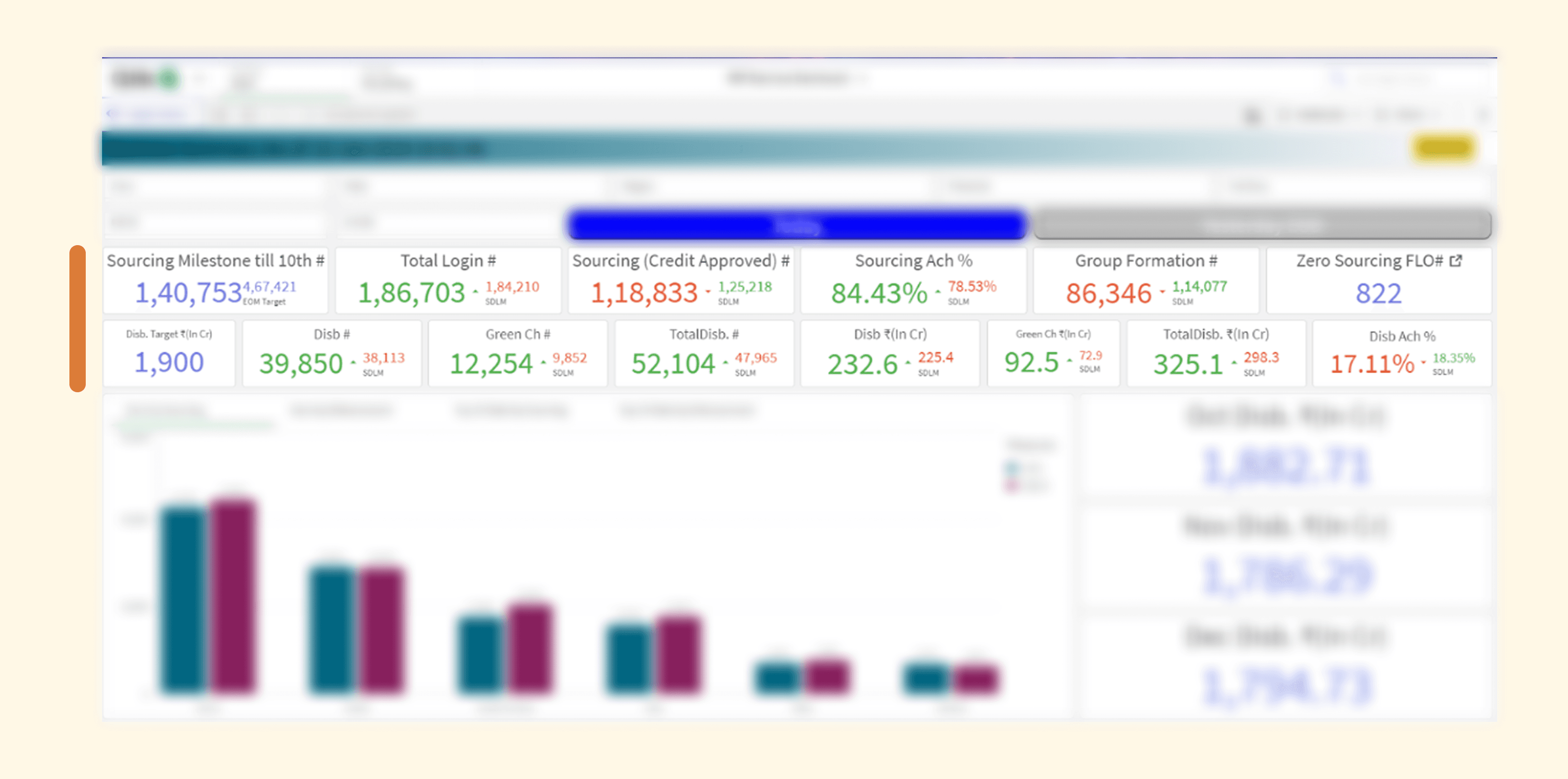
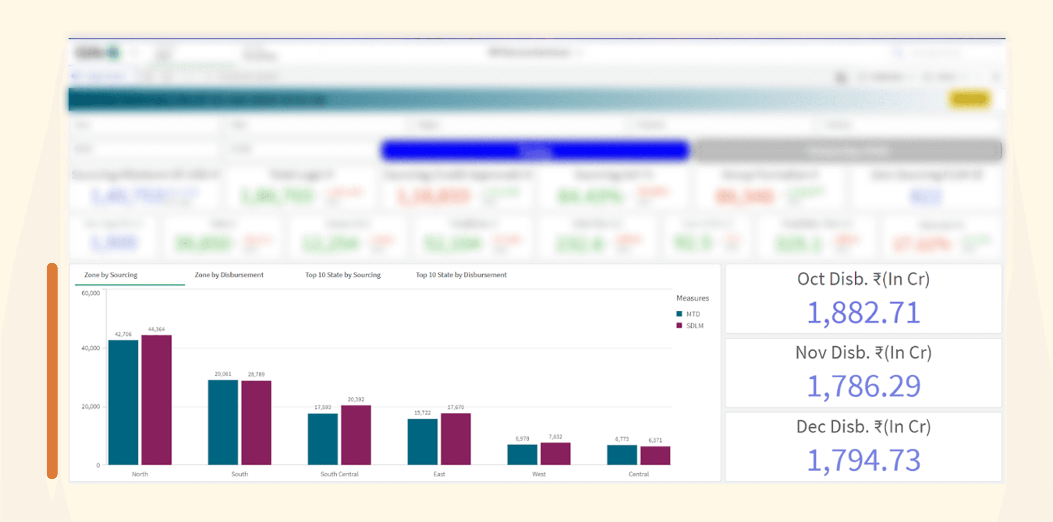
Before - Rural Business Finance Dashboard
HOWEVER, the dashboards required users to know where to look to interpret the data effectively.
Tons of financial KPIs with no clear logical structure
I interviewed C-suite and product teams to understand how they interpret data to make decisions.
Understanding technical subject matter through conversations with users & product teams
It turns out,
C-suite had a clear linear mental model for how they read data - but it didn't match how the dashboard presented it.
User's actual mental model for decision making (linear)
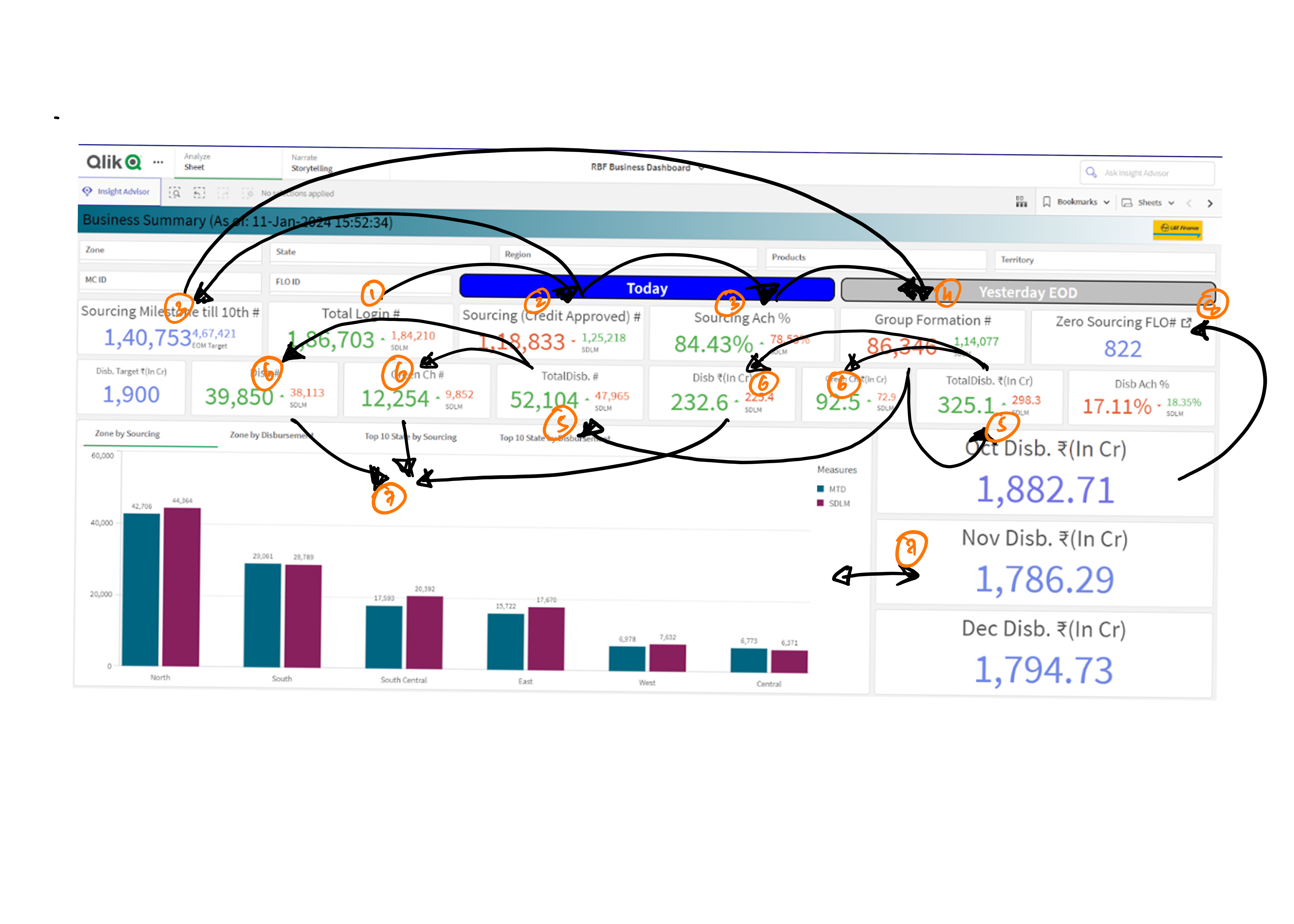
Versus how they actually read the dashboard (all over the place)
Additionally
The dashboards were counter-intuitive to the teams' working style - quick and efficient.
Decisions were often made by cross-referencing related data to spot anomalies, which the current design didn't support.
[ In that case ]
How might we streamline financial data to help executives cut through the noise and focus on what truly matters?
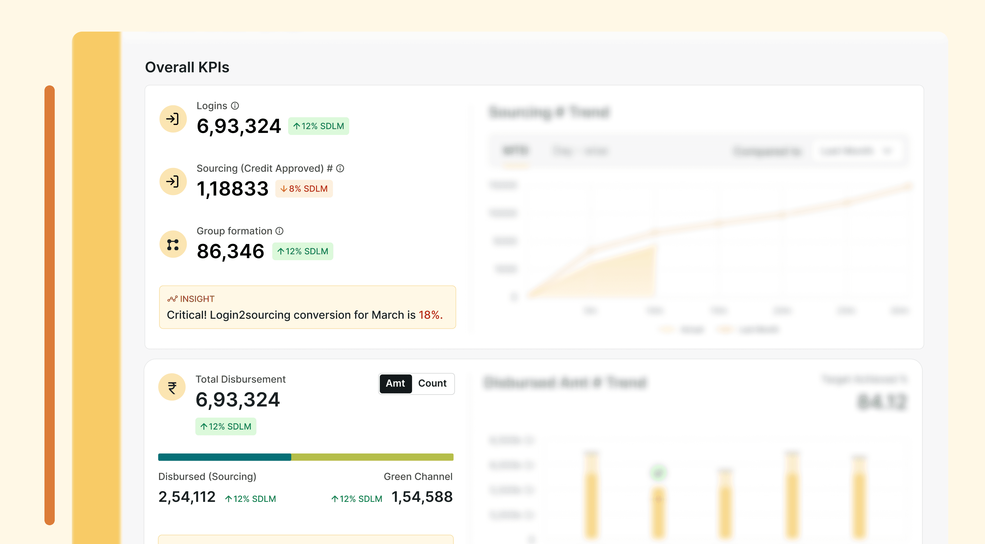
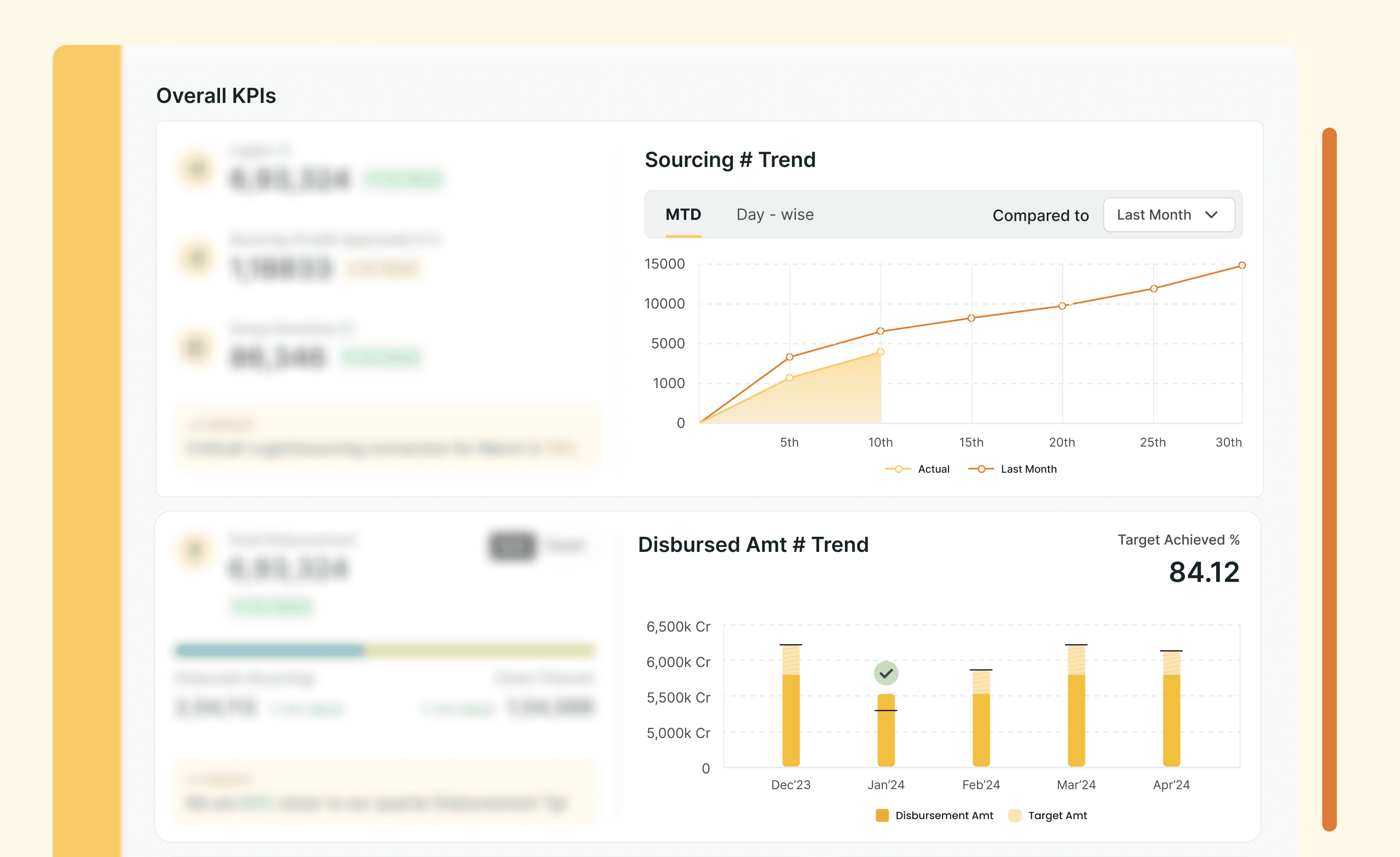
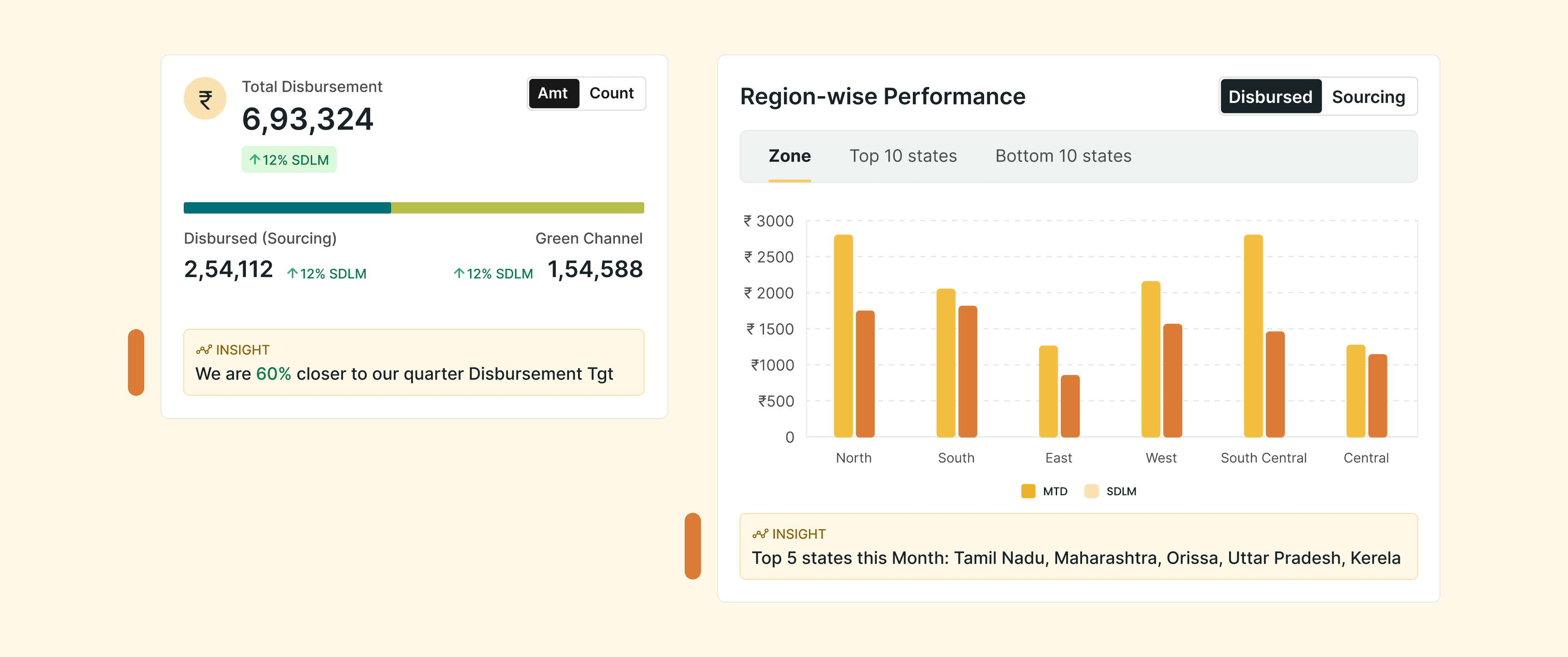
Narrative driven dashboard that matches how leaders actually think and decide.

Before
After
Story-like visualizations aligned with user mental models.
Before
After
Historical trends with benchmark context.
Before
After
Actionable insights, not just data.
After
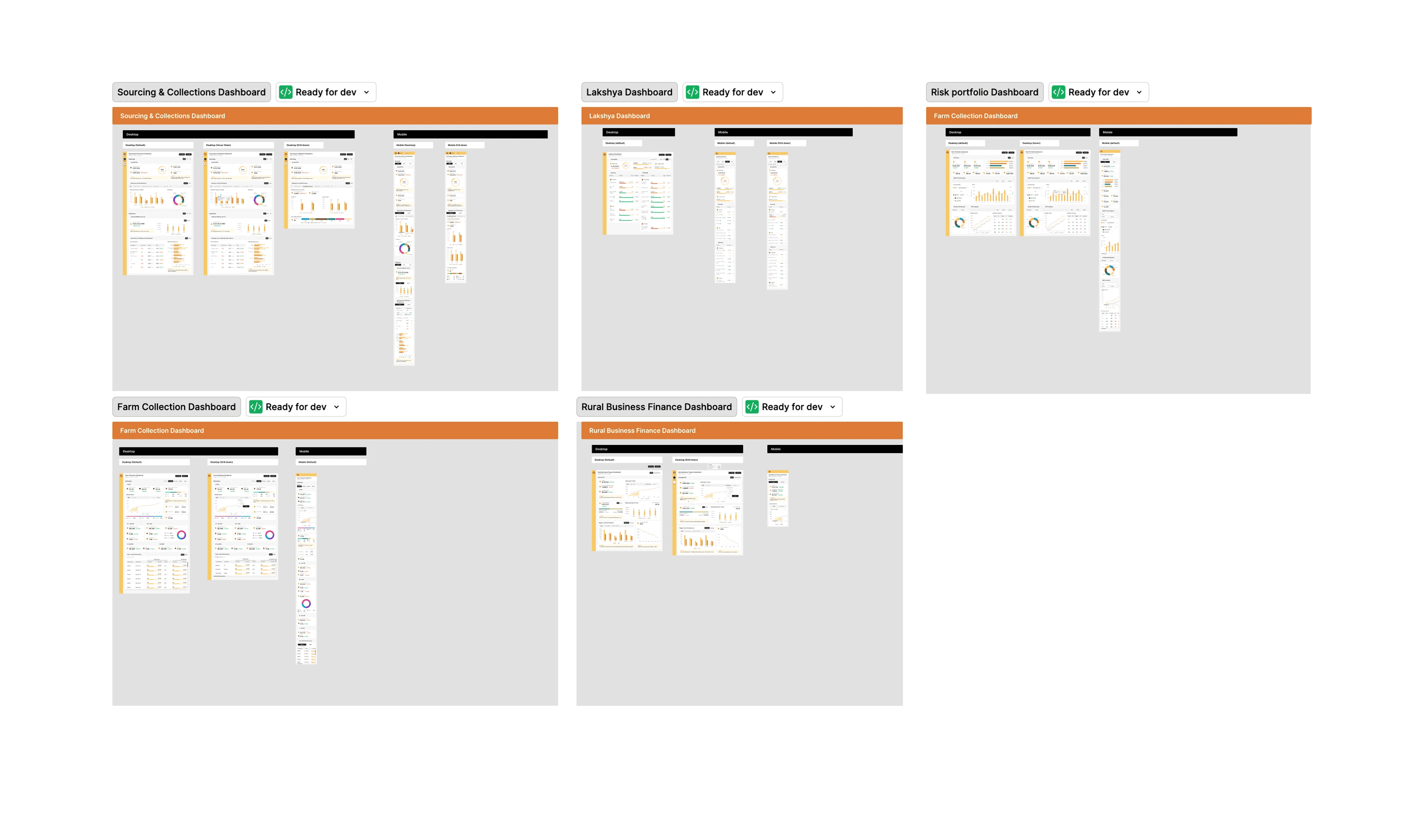
Project scope expanded to include 4 additional loan portfolios!
Used by C-Suite to review $6.27B in loan portfolios.
It's okay to sound stupid.
Don't shy away from asking even the most basic questions. It might feel awkward or obvious, but those supposedly "stupid" questions often spark deeper discussions. These conversations made the client rethink redundant data and helped me truly understand the purpose behind the numbers.
